
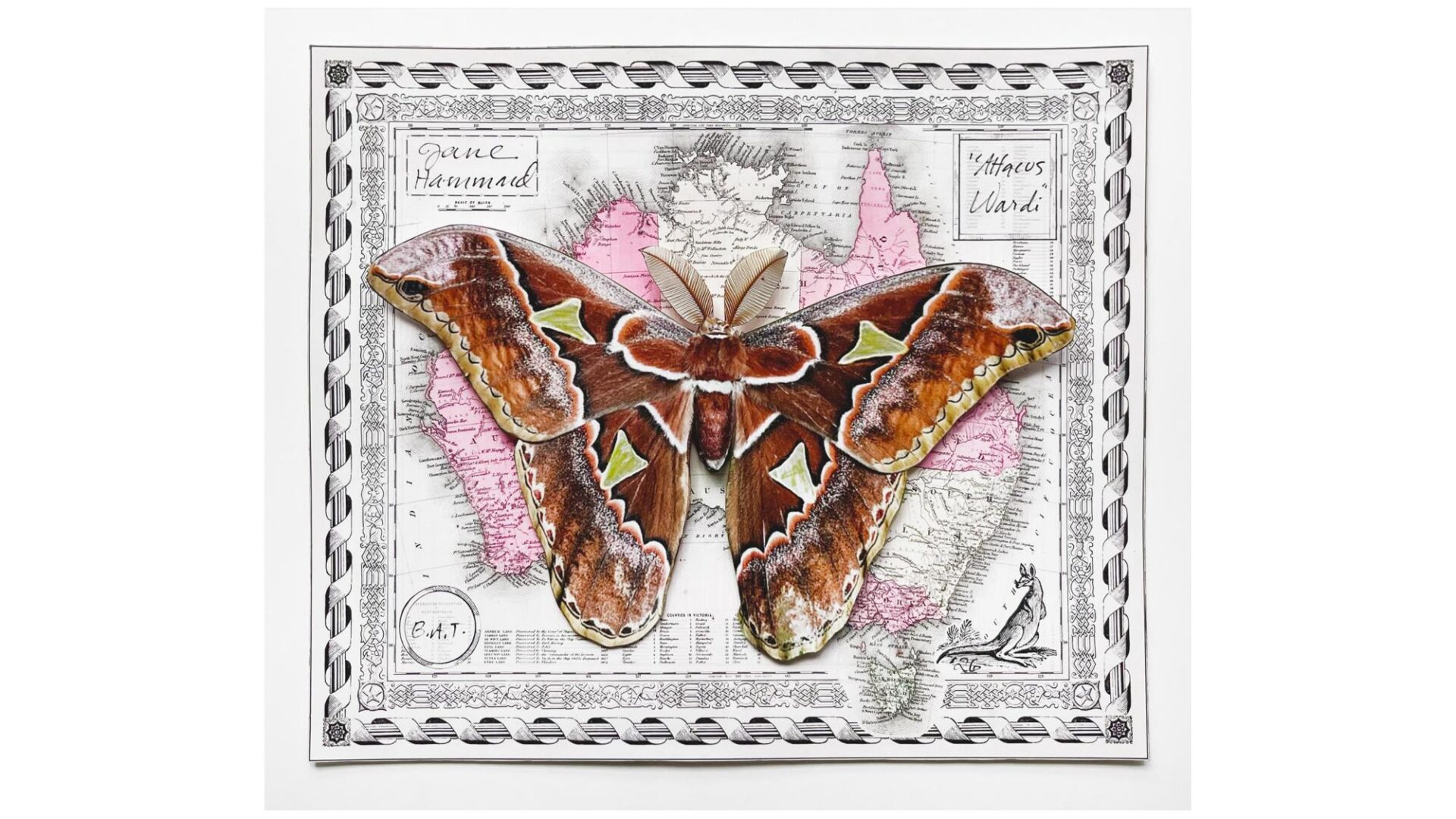
ARTIST: Jane Hammond
TITLE AND EDITION: Attacus Wardi, edition size 150 plus 1 Archive proof, 30 Artist Proofs, 15 Printer’s Proofs
DATE: 2026
MEDIUM: Digital printing with dimensional collage and hand coloring
PAPER: 7 3/4″ x 9 3/8″
PRINT DIMENSIONS: 7 3/4″ x 9 3/8″
Printers and Binders: Ruth Lingen, Katelyn Freeman-Cook, Matthew Dine, Hanna Wuttig
Artist’s Statement
Attacus Wardi presents an image of the giant Australian Silk Moth, native to the coastal forests surrounding the port of Darwin and Melville Island. In the print, these coastal areas are visible in the map just above the moth’s antennae.
“Attacus Wardi” is the second largest moth found in Australia, a continent known for its natural marvels. The moth exists for only one or two weeks in the huge and extravagant state presented in its actual size in the print. Using all its energy to find a mate and reproduce, it lacks both a mouth and digestive system as it never eats. All bets are on its dazzle as an enticement to produce the next generation of moths!
Needless to say, I chose “Attacus Wardi” for its beguiling beauty. I also wanted to depict a moth that inhabits a landmass surrounded by water (be it island or, in this case, continent) so that the moth’s discrete shape emulates the landmass. It’s impossible to say exactly why I chose this moth and this landmass but after trying several and lingering over Madagascar, I liked this pairing of species and place the best.
Notice how between the moth’s lower wings one can clearly see the letters AUS on the map, so there is no doubt about where this moth lives. Though the two shapes, body and continent, are juxtaposed in a seemingly logical manner, they also present wild dissimilarity, particularly of scale. The two together connote ideas of exploration, gathering and the accumulation of knowledge — both etymological and cartographic – that interest me greatly and are recurring themes in my work.
How the Print Was Made
First, we created three different digital prints: the maps, the moths and the moth antennae. The digital prints were made by Matthew Dine after I created protypes for each with the help of Jeffrey Scott French. I added several graphic elements to an existing vintage map of Australia: the thin black outer border, the ornate inner border scroll pattern, and the cartouches in the four corners which hold my signature, the date and the edition number. Notice that the year of the print sits below the added kangaroo’s tail. The impressions of the map, which act as substrates for the moth, were signed early on, before the moth alighted.
The moths’ form was cut out with scissors. The now-exposed white edges were painted umber, ochre and sienna to blend the moth’s edges with the body, which in effect gives a three-dimensionality to the form. The moth was then misted with an aqueous solution of fine mica powder to impart iridescence. With the moths now ready to be adhered to the maps, the labor-intensive artistry of three-dimensional assembly began.
First, small round dots of hole-punched archival paper were mounted one on top of the other with Jade glue behind the moth’s head. This created space between the moth’s head and the antennae to establish volume. The antennae were cut out, crimped gently to achieve three-dimensionality and glued to the underside of the moth’s head. Then the moth’s body was gently formed, “curved” if you will, by rolling it around a dowel to impart a slight curl to the paper, so that when unrolled, the body had a slight rounded three-dimensionality about it.
Small bullet-shaped lifts were formed using archival foam core, wrapped in brown Japanese paper and adhered using methylcellulose. These shapes were used to create the three-dimensional body below the printed body that was adhered to it using Jade glue. This important nuance is visible when the print is viewed from the side.
The now fully assembled 3-D moth was then adhered to the map. First the central body was glued and weighted with small sandbags while drying. Four “lifts” created from archival paper were positioned and adhered to the map below the wings. The wings were then glued onto these lifts to anchor and secure them, while also visually “floating” them above the underlying map.
I provided the many fabrication steps outlined above as written instructions to the printer, Ruth Lingen, with whom I have worked on prints and monographs for decades. I further documented the process in a series of videos to aid in the construction process that required delicate nuancing of the moth’s body, best visualized in video form.
Ruth Lingen of Pace Editions and Line Editions, with her assistant Katelyn Freeman-Cook, completed all of the fabrication steps for the entire edition.